Text Effects

Redefine Your Typography with Creative Warp Effects

Typography is a crucial aspect of design, and with Snapied text transformation tools, you can modify your text to create standout visuals that integrate seamlessly with your overall layout. Our text effects feature allows you to apply creative warp effects, transforming ordinary text into an engaging design element that enhances your message and captivates your audience.

Creative Typography
Text Effects Demo
Multiple Warp Options
Easy Adjustments

Introduction

Effective Communication

Effective typography not only communicates your message clearly but also enhances the overall design aesthetic. The right text effects can emphasize key points and guide your audience's attention to important information.

Creative Customization

With Snapied text transformation, you have the power to adjust and curve your text with a range of warp effects, transforming ordinary text into an engaging design element that stands out from the crowd.

Versatile Applications

Whether you're designing digital banners, posters, social media graphics, or logos, these tools enable you to customize your typography for a unique look that fits your specific project needs.

How to Apply Snapied Text Transformation

Follow these simple steps to transform your text with creative warp effects

1

Select the Textbox

Click on the textbox that contains the text you want to modify. This action activates the text element and readies it for transformation, ensuring that your changes will only affect the selected text.

Selecting a Textbox
2

Open the Transformations Panel

In the right-hand navigation, click on Transformations. This panel provides you with various text transformation options available through Snapied text transformation tools, giving you access to all the warp effects you can apply.

Opening the Transformations Panel
3

Choose Your Warp Effect

Select one of the warp effects from the available options. The list includes various effects like WARP_ARC, WARP_BULGE, WARP_FLAG, and many more. Each effect creates a different transformation, allowing you to find the perfect style for your design.

Choosing a Warp Effect
4

Adjust the Blending Value

After selecting a warp effect, fine-tune the blending value to control how the transformed text interacts with the background and other design elements. This adjustment helps achieve a balanced and integrated look that enhances your overall design.

Adjusting the Blending Value

Detailed Overview of Warp Effects

Explore the variety of text transformation options available

WARP_ARC

Curves the entire text along a smooth, circular path for a rounded appearance. This effect is perfect for creating logo designs, badges, or any text that needs to follow a gentle curve.

WARP_ARC_LOWER

Applies a downward curve to the text, with the lower portion bending more prominently to create a gentle dip. This effect works well for creating a friendly, approachable feel in your typography.

WARP_ARC_UPPER

Bends the upper part of the text upward, forming a pronounced arch that highlights the top section. This effect is ideal for creating uplifting, positive messaging in your designs.

WARP_ARCH

Shapes the text into a balanced, symmetric arch, giving a uniform curved effect throughout. This classic effect is perfect for headers, titles, and any text that needs to create a sense of elegance.

WARP_BULGE

Creates a three-dimensional, convex effect, making the letters appear puffed out for added depth. This effect adds a playful, dynamic quality to your text that draws attention.

=

WARP_FLAG

Mimics the undulating motion of a flag, producing a dynamic, wavy distortion that adds a sense of movement. This effect is perfect for creating a sense of motion or energy in your designs.

WARP_FISH

Warps the text in an organic, asymmetrical manner reminiscent of a fish's form, offering a unique contour. This creative effect is ideal for designs with a nautical theme or those needing a distinctive shape.

WARP_RISE

Arranges the text in an ascending curve, giving the impression that the letters are gradually rising. This effect creates a sense of growth, progress, or optimism in your messaging.

WARP_INFLATE

Expands the text to create a fuller, puffy appearance, as if the letters are inflated. This playful effect adds volume and presence to your typography, making it stand out.

WARP_SQUEEZE

Compresses the text horizontally or vertically, resulting in a more compact and condensed look. This effect is useful for fitting text into specific spaces while maintaining readability.

WARP_WAVE_LOWER

Introduces a rhythmic, wave-like motion that predominantly affects the bottom edge of the text. This effect creates a flowing, liquid-like appearance that adds movement to your design.

WARP_WAVE_UPPER

Applies a similar wave effect to the top of the text, creating smooth oscillations along the upper edge. This effect is perfect for designs with themes of water, sound, or rhythm.

Benefits of Snapied Text Transformation

Discover how text effects can enhance your designs

Custom Typography

Create a unique text style that reflects your design vision. With multiple warp effects to choose from, you can craft typography that perfectly matches your brand identity and stands out from standard text treatments.

Visual Integration

Blend your text seamlessly with background elements to maintain a cohesive look. The ability to adjust blending values ensures that your text works harmoniously with other design elements, creating a unified visual experience.

Enhanced Creativity

Experiment with multiple warp effects to discover new, engaging text layouts. This creative flexibility allows you to push the boundaries of traditional typography and develop innovative design solutions that capture attention.

Improved Readability

Adjust the curvature and blending to ensure that your text remains clear and legible even with creative distortions. The ability to fine-tune these parameters means you can create eye-catching effects without sacrificing communication.

Expert Tips for Text Effects

Maximize the impact of your text transformations with these professional insights

Match Effect to Message

Choose a warp effect that complements your message. For example, use WARP_RISE for uplifting content, WARP_FLAG for dynamic messaging, or WARP_ARC for traditional, elegant typography. The right effect can reinforce your communication goals.

Consider Font Weight

Different warp effects work better with different font weights. Bold fonts often maintain better legibility with extreme warps, while lighter fonts may work better with subtle effects. Experiment with combinations to find the perfect balance.

Test Readability

Always check that your transformed text remains readable. View your design at different sizes and distances to ensure the message is clear. If readability suffers, try adjusting the intensity of the effect or choosing a different warp style.

Use Contrast Wisely

Ensure there's sufficient contrast between your warped text and the background. This becomes even more important with transformed text, as some parts may become thinner or closer to background elements. Good contrast preserves legibility.

Creative Applications for Text Effects

Discover how text transformation can enhance various design projects

Logo Design

Create distinctive, memorable logos by applying warp effects to your brand name or initials. Effects like WARP_ARC or WARP_BULGE can add personality and uniqueness to your brand identity.

Social Media Graphics

Make your social posts stand out with eye-catching text effects. Use WARP_FLAG or WARP_WAVE effects to create dynamic, attention-grabbing headlines that increase engagement.

Promotional Materials

Enhance banners, posters, and advertisements with text that follows the contours of your design elements. WARP_ARC and WARP_ARCH effects work particularly well for creating cohesive promotional layouts.

Website Headers

Create distinctive website headers with text that follows the contours of your design. Effects like WARP_WAVE can add a dynamic, modern feel to your web presence.

Pro Tip

For the most professional results, combine text effects with complementary design elements. For example, if you're using WARP_WAVE, consider adding subtle wave graphics or flowing lines to reinforce the effect. This creates a cohesive design where the text transformation feels intentional and integrated.

When working with longer text, consider applying warp effects only to headlines or key phrases rather than body text. This maintains readability for important information while still adding visual interest to your design. The contrast between warped headlines and straight body text creates a pleasing visual hierarchy.

Conclusion

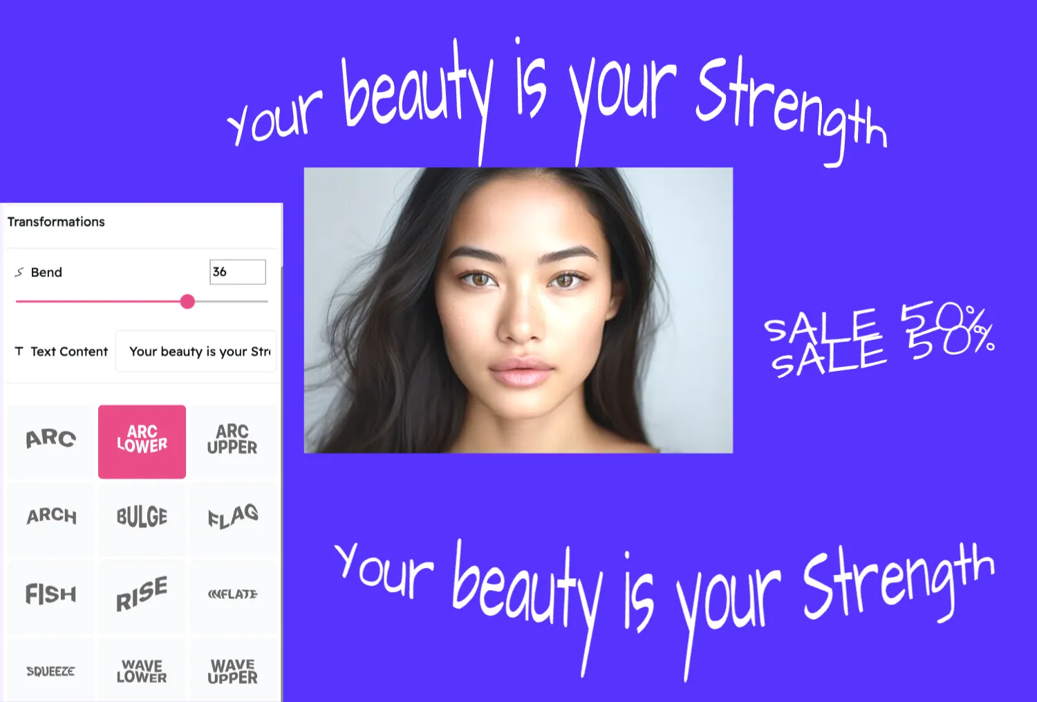
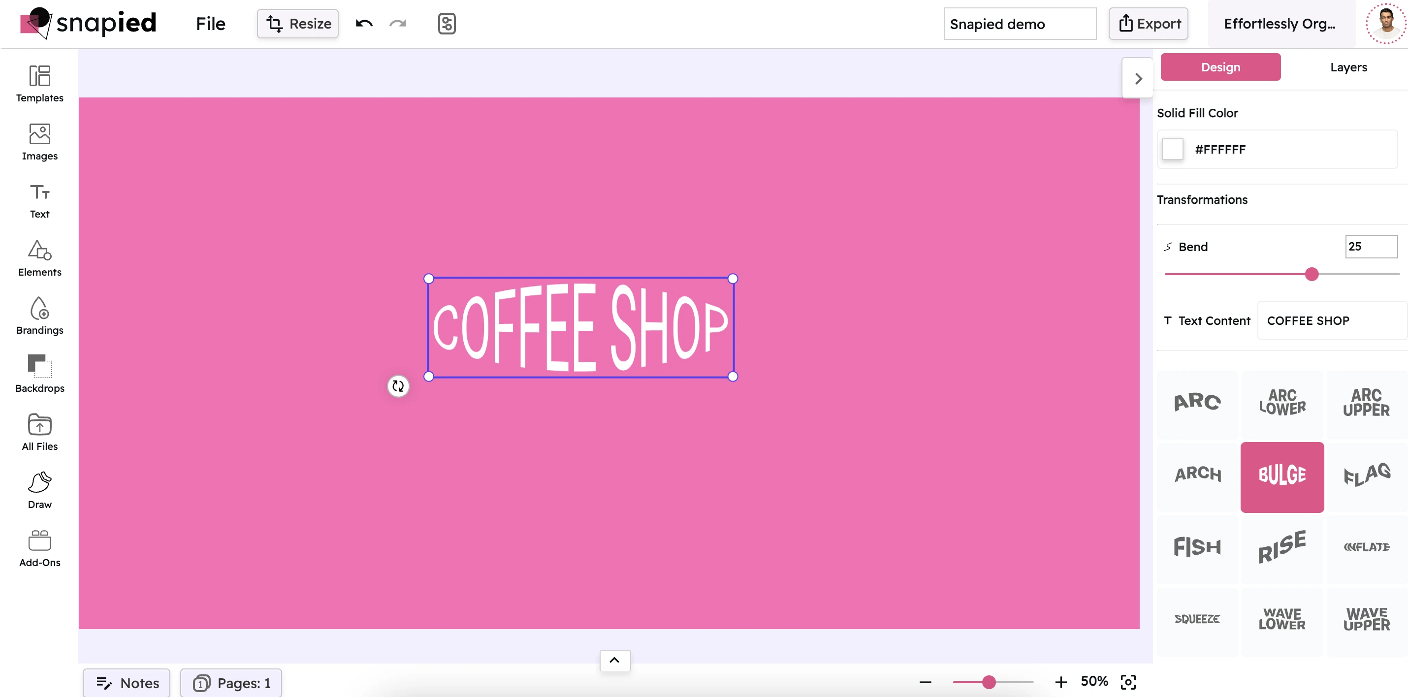
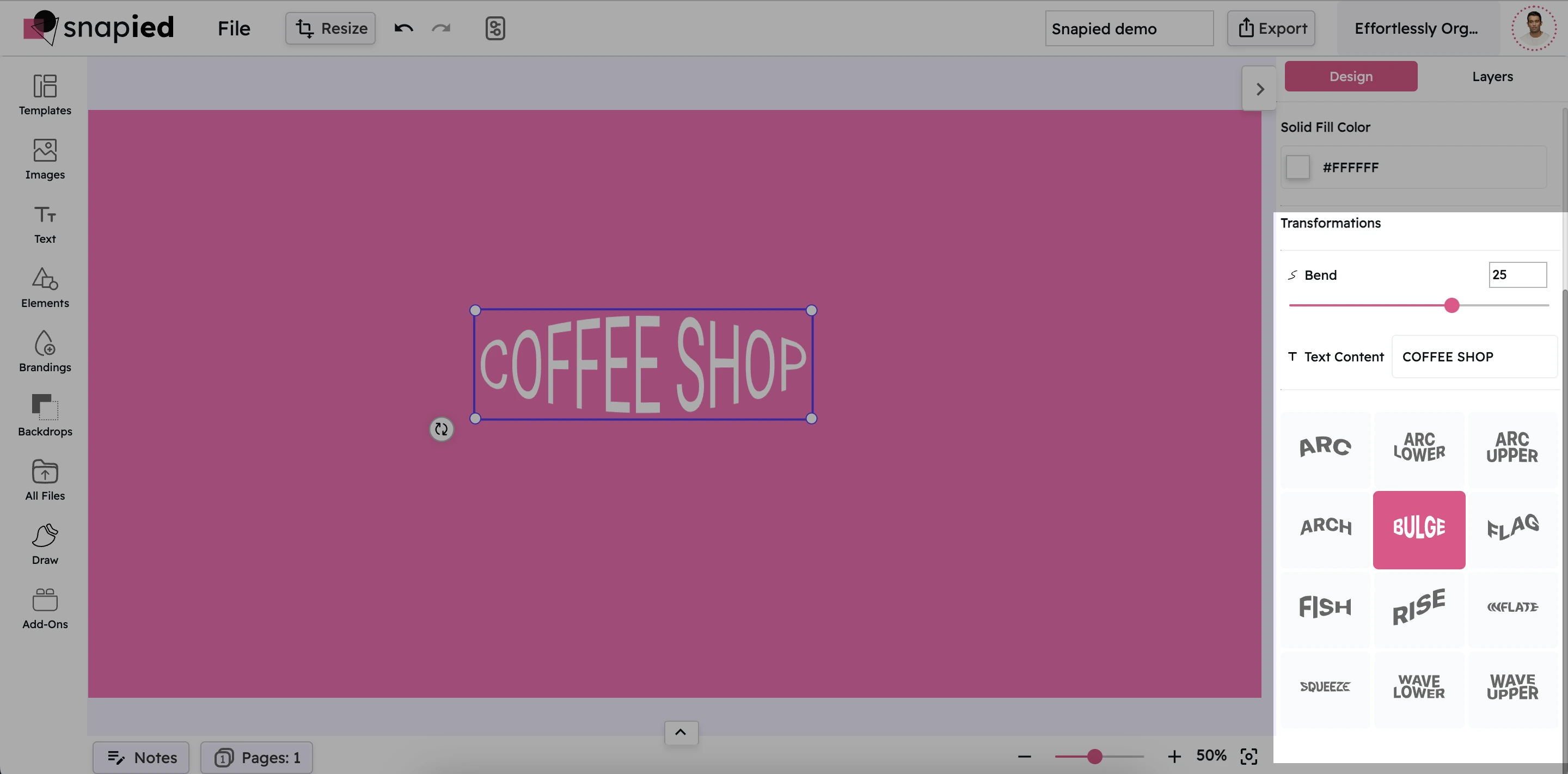
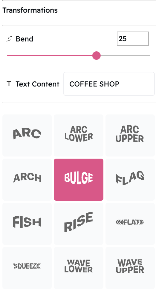
Snapied text transformation empowers you to reshape your typography with a variety of creative warp effects. By following the simple steps outlined above, you can easily apply and adjust effects such as WARP_ARC, WARP_FLAG, and WARP_BULGE to craft text that not only stands out but also integrates naturally with your design.

Experiment with these options and blending values to find the perfect balance for your project, and take your typography to the next level. Whether you're creating logos, social media graphics, or promotional materials, these text effects provide the tools you need to create professional, eye-catching designs that effectively communicate your message.

Ready to Transform Your Typography?

Create eye-catching designs with creative text effects that elevate your message.

Warp. Transform. Impress.

Take your typography to the next level with Snapied text effects.