Blend Text with Images
Creating Balance: How to Blend Text with Your Design Elements
Combine your text with background design elements for a cohesive and unified look.
With the Blend Text adjustment, you can control how your text interacts with underlying layers, ensuring your design remains consistent and well-integrated.
How to Apply Blend Text Adjustments
Follow these simple steps to blend your text with background elements
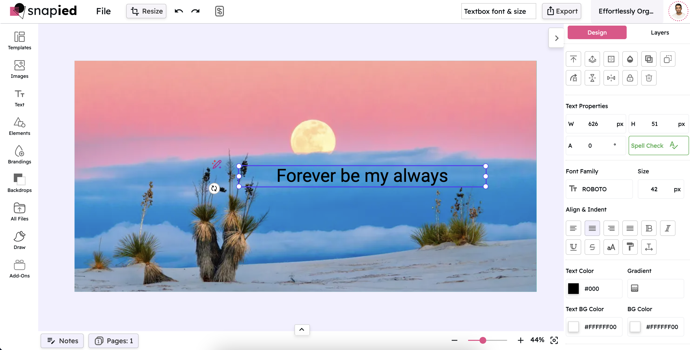
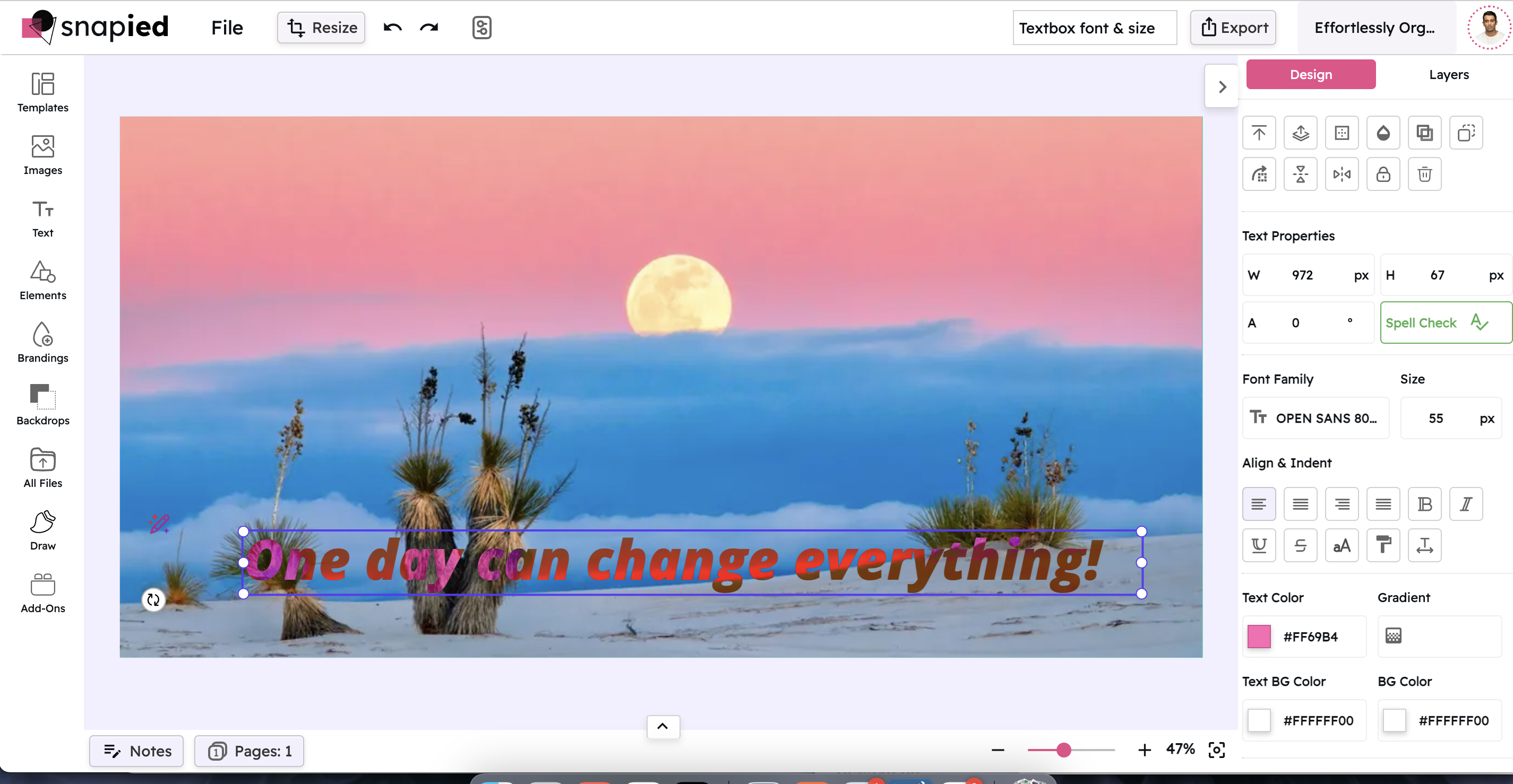
Select the Textbox
Click on the textbox that contains the text you want to modify. This action activates the text element for editing, allowing you to make changes to its appearance and how it interacts with other design elements.
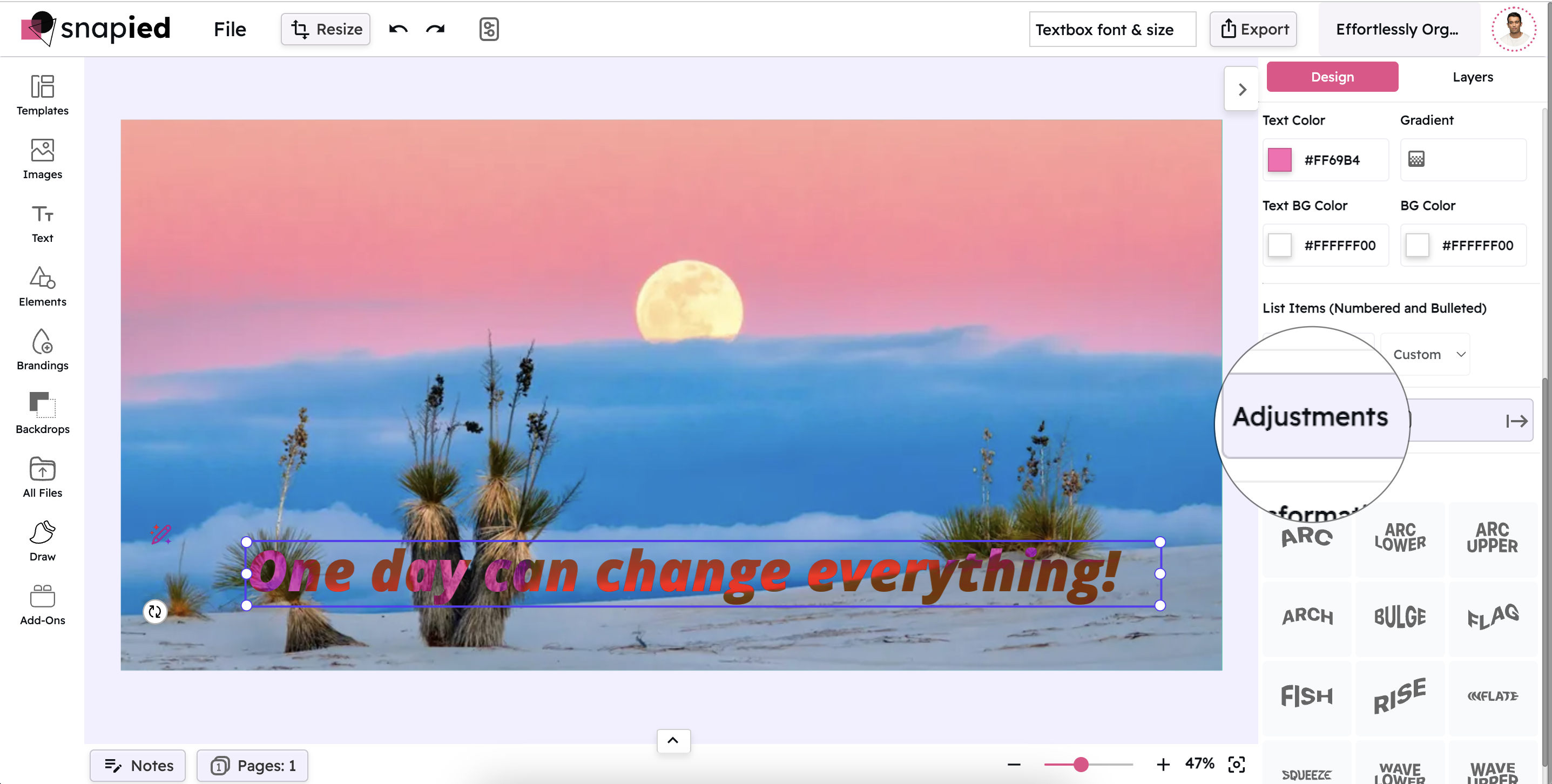
Open the Adjustments Panel
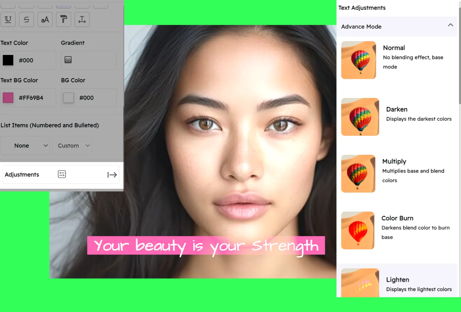
In the right-hand navigation, click on Adjustments. This displays various text adjustment options, including the blend text settings. The panel provides access to all the tools you need to modify how your text interacts with other elements.
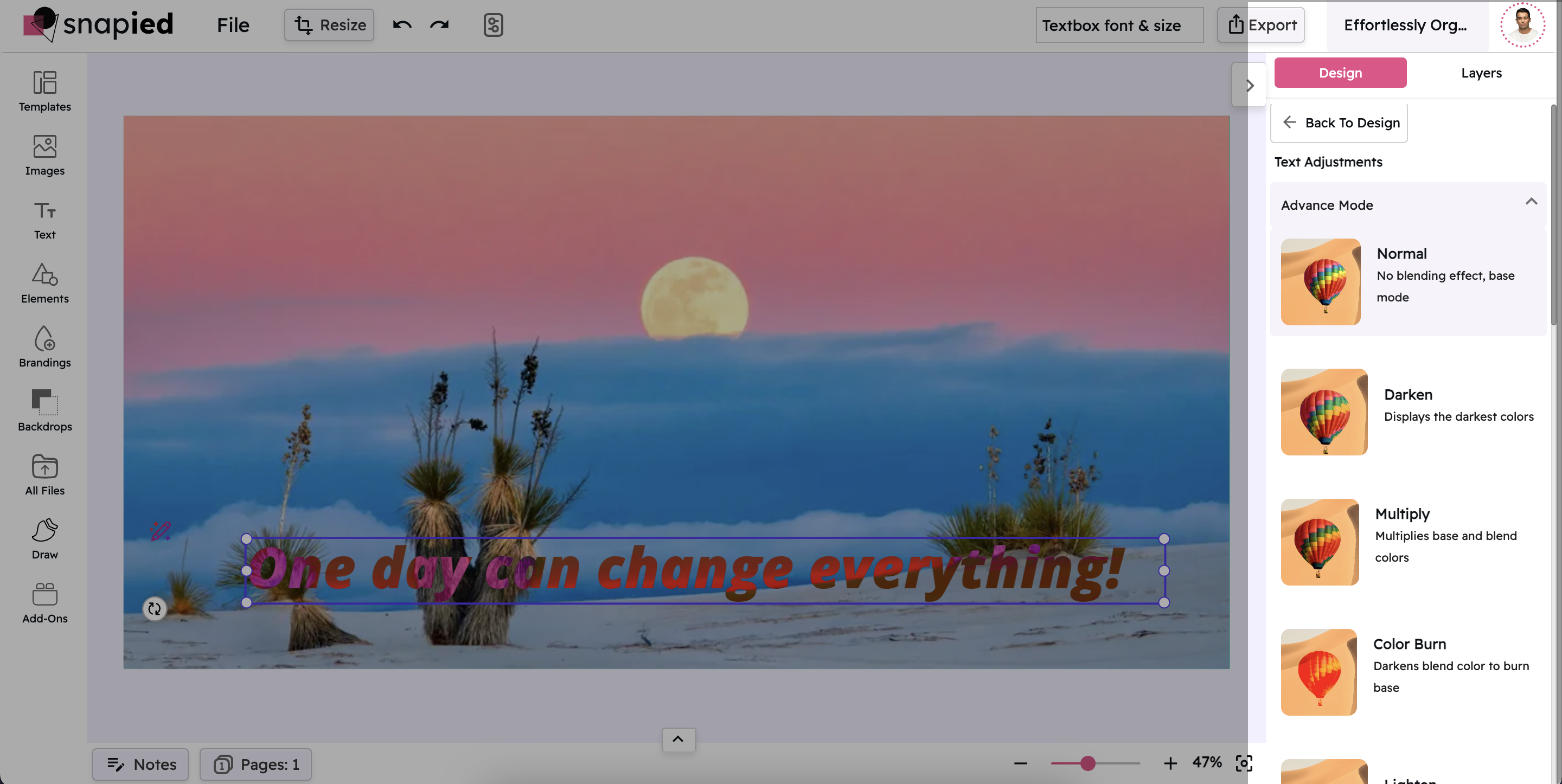
Choose the Blend Text Option
From the available options, select the blend text adjustment. This enables you to apply different blend modes to your text and merge it with your design elements. You'll see a dropdown menu with various blend modes to choose from.
Apply a Blend Mode
Select a blend mode from the dropdown menu to see how it affects your text. Each mode creates a different interaction between your text and the background elements. Experiment with different modes to find the one that best suits your design goals.
Overview of Blend Modes
Blend modes control how your text layer interacts with the layers behind it

Normal
No blending effect; the text displays in its base state. This is the default mode where your text appears exactly as styled, without any interaction with background elements.

Multiply
Multiplies color values of the text and background for a deeper tone. This creates a darkening effect, similar to layering multiple transparent inks on paper.

Screen
Inverts, multiplies, and then inverts the colors again to brighten the image. This creates a lightening effect, similar to projecting multiple images on a screen.
Overlay
Combines Multiply and Screen to adjust contrast—darkening dark areas and lightening light ones. This preserves highlights and shadows while increasing contrast.

Darken
Displays the darkest colors from both the text and background. This mode compares the text and background colors and keeps whichever is darker at each pixel.

Lighten
Shows the lightest colors from the text and background. This mode compares the text and background colors and keeps whichever is lighter at each pixel.

Color Dodge
Brightens the base color using the blend, creating a subtle glow. This mode divides the background color by the inverse of the text color, resulting in a brightened effect.

Color Burn
Darkens the blend color to intensify the base image. This mode divides the inverted background by the text color and then inverts the result, creating a darkening effect.

Hard Light
Similar to Overlay but with higher contrast for a more pronounced effect. This mode is like shining a harsh spotlight on the background through the text.

Soft Light
Applies a gentle lightening effect to soften the text. This mode is like shining a diffused spotlight on the background through the text, creating a subtle, soft effect.

Difference
Displays the absolute difference between text and background colors, creating striking contrast. This mode subtracts the darker of the two colors from the lighter one.

Exclusion
Produces a similar effect to Difference, but with a milder contrast. This creates an effect similar to Difference but with lower contrast and a more subtle appearance.
Creative Applications for Blend Text
Discover how blend modes can enhance your designs
Photo Overlays
Create stunning text overlays on photographs by using blend modes like Overlay or Soft Light. These modes allow your text to interact with the image's colors and tones, creating a more integrated and professional look than standard text placement.
Textured Typography
Apply texture to your text by using blend modes like Multiply or Overlay with textured backgrounds. This technique adds depth and character to your typography, making it more visually interesting and unique compared to flat text.
Special Effects
Create dramatic visual effects by using blend modes like Difference or Exclusion. These modes can produce unexpected color interactions that add a creative, artistic touch to your designs, perfect for attention-grabbing headers or feature text.
Brand Consistency
Maintain visual consistency across different backgrounds by using blend modes to adapt your text to various contexts. This approach ensures your branding remains recognizable while still integrating harmoniously with different design elements.
Expert Tips for Blend Text
Maximize the impact of your text blending with these professional insights
Consider Readability
While blend modes can create stunning visual effects, always prioritize readability. Test your design with different viewers to ensure your text remains legible, especially when using high-contrast modes like Difference or Exclusion.
Experiment with Font Weight
Different blend modes work better with different font weights. Lighter blend modes like Screen often work well with bold fonts, while darker modes like Multiply may require thicker fonts to maintain visibility. Experiment with combinations to find the perfect balance.
Layer Multiple Blend Modes
For more complex effects, try using multiple text layers with different blend modes. This technique can create rich, multi-dimensional typography that adds depth and interest to your design. Start with a base layer and build up additional effects gradually.
Test on Different Backgrounds
The same blend mode can produce dramatically different results depending on the background. Always test your chosen blend mode on various backgrounds to ensure it works consistently across your design. This is especially important for responsive designs where backgrounds might change.
Pro Tip
For the most professional results, combine blend modes with subtle opacity adjustments. Reducing the opacity of your text slightly (to around 90-95%) can create a more natural integration with background elements while maintaining readability.
When working with photographs, try using the Overlay blend mode with white or light-colored text. This technique allows the text to pick up the underlying image details while remaining legible, creating a sophisticated, magazine-style effect.
Ready to Blend Your Text?
Create seamless, integrated designs by blending your text with background elements.
Take your typography to the next level with blend modes.

