Add Background Color To Text

Set the Perfect Tone for Your Text Container

Defining the background color for your text container is a simple yet powerful way to create a cohesive design.

With just a few clicks, you can choose a color that complements your overall layout and enhances readability. This feature allows you to create visual separation between different content sections, highlight important information, and establish a consistent visual hierarchy throughout your design.

Visual Appeal
Enhanced Readability
Cohesive Design

How to Set Background Color

Follow these simple steps to update your text container's background color

1

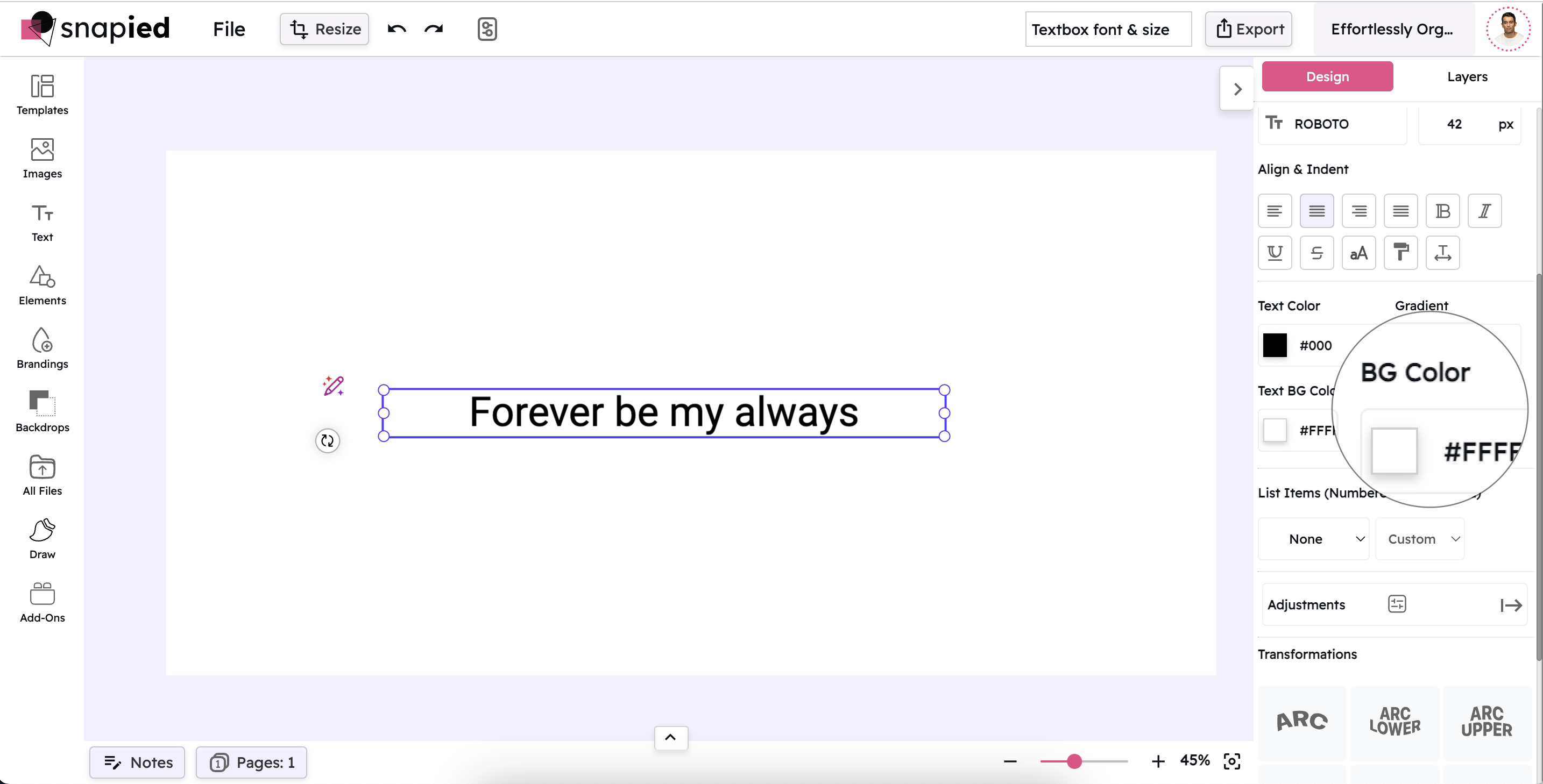
Select the Textbox

Click on the textbox you want to modify. This action ensures that the text container is active and ready for changes. The selection will be indicated by a highlight or outline around the textbox.

Selecting a Textbox
2

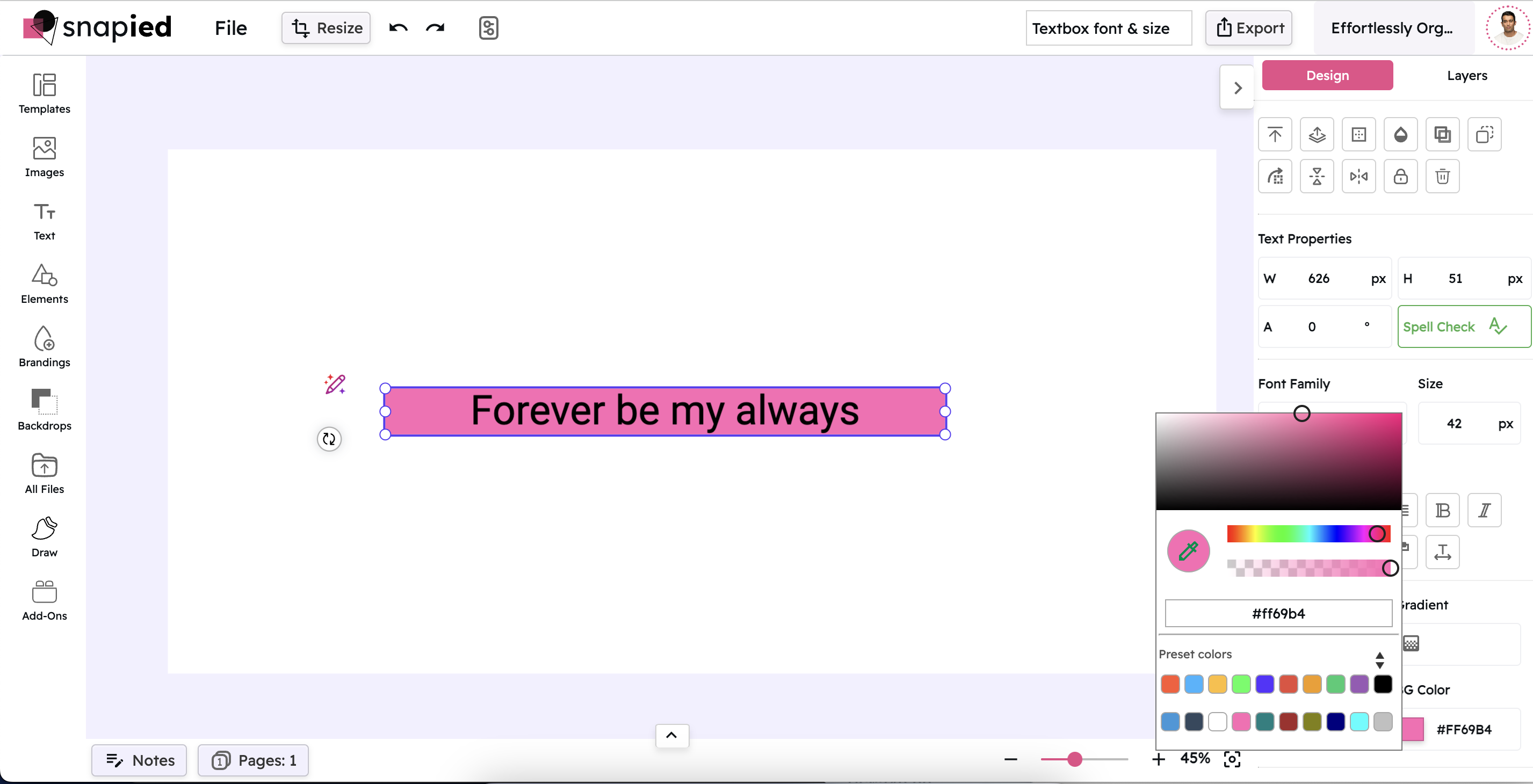
Open the Background Color Picker

In the right-hand navigation panel, locate and click on the Background Color option. This will open a color picker box, allowing you to see a wide range of color choices. The color picker provides various ways to select your desired color.

Opening the Background Color Picker
3

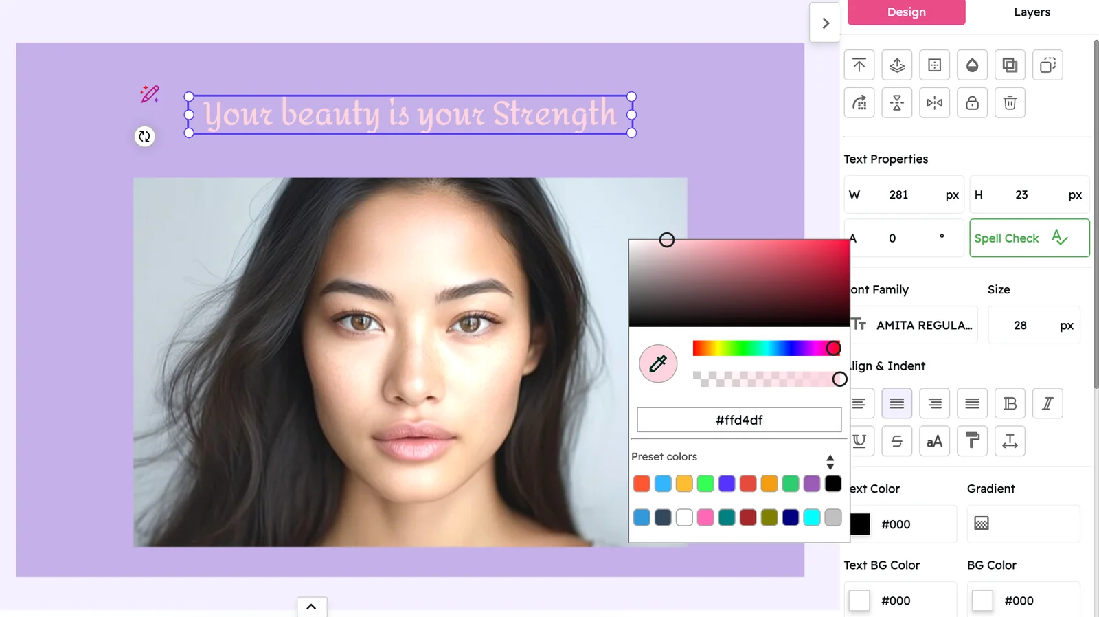
Choose Your Color

Use the color picker to select the desired color. You can either choose from the preset palette or enter a specific HEX code for precise color matching. You can also adjust the opacity of the color to create semi-transparent backgrounds.

Choosing a Background Color

Background Color Examples

Explore different background color options and their effects

Light text on a dark background creates strong contrast and is ideal for headlines or important information.

Light on Dark

This high-contrast combination is excellent for creating emphasis and drawing attention to key messages. It works well for headers, call-to-action buttons, and important announcements.

Dark text on a light background offers excellent readability for longer content and is easy on the eyes.

Dark on Light

This classic combination provides optimal readability for body text and longer content. It's the standard choice for most professional documents and websites where legibility is paramount.

Using your brand color as a background reinforces brand identity and creates a cohesive visual experience.

Brand Color

Incorporating your brand's primary color as a background helps strengthen brand recognition and creates a consistent visual identity across all your materials.

Complementary colors create visual interest and can help highlight specific sections of your content.

Complementary Color

Using colors opposite on the color wheel creates dynamic contrast that draws attention. This approach works well for highlighting special offers, new features, or important updates.

Neutral backgrounds provide a subtle, professional look that lets your content take center stage.

Neutral Color

Soft grays, beiges, and off-whites create an understated backdrop that works well for professional communications where the focus should be on the content rather than the design.

Accent colors can be used to highlight specific sections and create visual hierarchy in your design.

Accent Color

Secondary colors from your brand palette can be used as background colors to create visual interest and help organize information into distinct sections.

Why Background Color Matters

Discover how this simple adjustment can significantly impact your design

Improved Readability

Setting a background color for your text container improves readability by creating a clear contrast between text and its backdrop. This visual separation makes content easier to scan and comprehend, especially for longer passages or when reading on different devices and screen sizes.

Visual Organization

Background colors help organize information by creating visual sections within your design. Different colors can signify different types of content, making it easier for viewers to navigate through your material and understand its structure.

Brand Consistency

Using background colors that align with your brand palette helps create a cohesive visual identity. This consistency reinforces brand recognition and creates a more professional, polished appearance across all your design materials.

Pro Tips for Background Colors

Maximize the impact of your background colors with these expert insights

Consider Contrast Ratios

Ensure there's sufficient contrast between your text and background colors for optimal readability. For accessibility, aim for a contrast ratio of at least 4.5:1 for normal text and 3:1 for large text. This helps ensure your content is readable for all users, including those with visual impairments.

Use Color Psychology

Different colors evoke different emotions and associations. Blues convey trust and professionalism, greens suggest growth and health, while reds create urgency and excitement. Consider the emotional impact of your background color choices and how they align with your message.

Test on Multiple Devices

Colors can appear differently across various screens and devices. Always test your background color choices on multiple devices to ensure they look as intended and maintain proper contrast with your text. This helps ensure a consistent experience for all users regardless of how they access your content.

Final Thoughts

Setting a background color for your text container is a quick adjustment that can significantly impact the visual appeal and effectiveness of your design. By creating clear contrast between text and background, you improve readability while also establishing a cohesive visual identity that aligns with your brand.

Remember that the best background color choices consider both aesthetics and functionality. They should complement your overall design while ensuring that your content remains accessible and easy to read. With Snapied's intuitive color picker, you can easily experiment with different options until you find the perfect background color for your text container.

Ready to Enhance Your Text Containers?

Create visually appealing designs with perfectly matched background colors.

Select. Color. Impact.

Transform your text containers with the perfect background color.