Font Family & Size
Achieve Perfect Typography for Your Design
Typography is much more than choosing a font—it's a vital part of your design that shapes how your message is perceived. The right font and text size can improve readability, set the tone, and create a visual hierarchy that guides your viewer's eye through your content.
In this guide, we'll explore how to easily update your text style using Snapied's intuitive interface, ensuring your typography contributes to a polished and cohesive design.
Why Typography Matters
Good typography is the cornerstone of effective communication
Readability
The right font and size ensure that your content is easy to read, whether on a mobile screen or a large monitor. Good readability reduces eye strain and keeps your audience engaged with your content.
Brand Consistency
Consistent typography helps reinforce your brand identity. A well-chosen font can become synonymous with your brand's style, making your content instantly recognizable to your audience.
Visual Hierarchy
Varying font sizes and weights can emphasize important information, guiding your audience through your content seamlessly. A clear hierarchy helps readers understand what's most important at a glance.
Mood and Tone
Different fonts evoke different emotions. A formal serif might convey tradition and reliability, while a modern sans-serif suggests simplicity and clarity. Your font choice sets the emotional tone for your entire design.
How to Change Your Font Family & Size with Snapied
Snapied makes updating your typography simple with a few intuitive steps
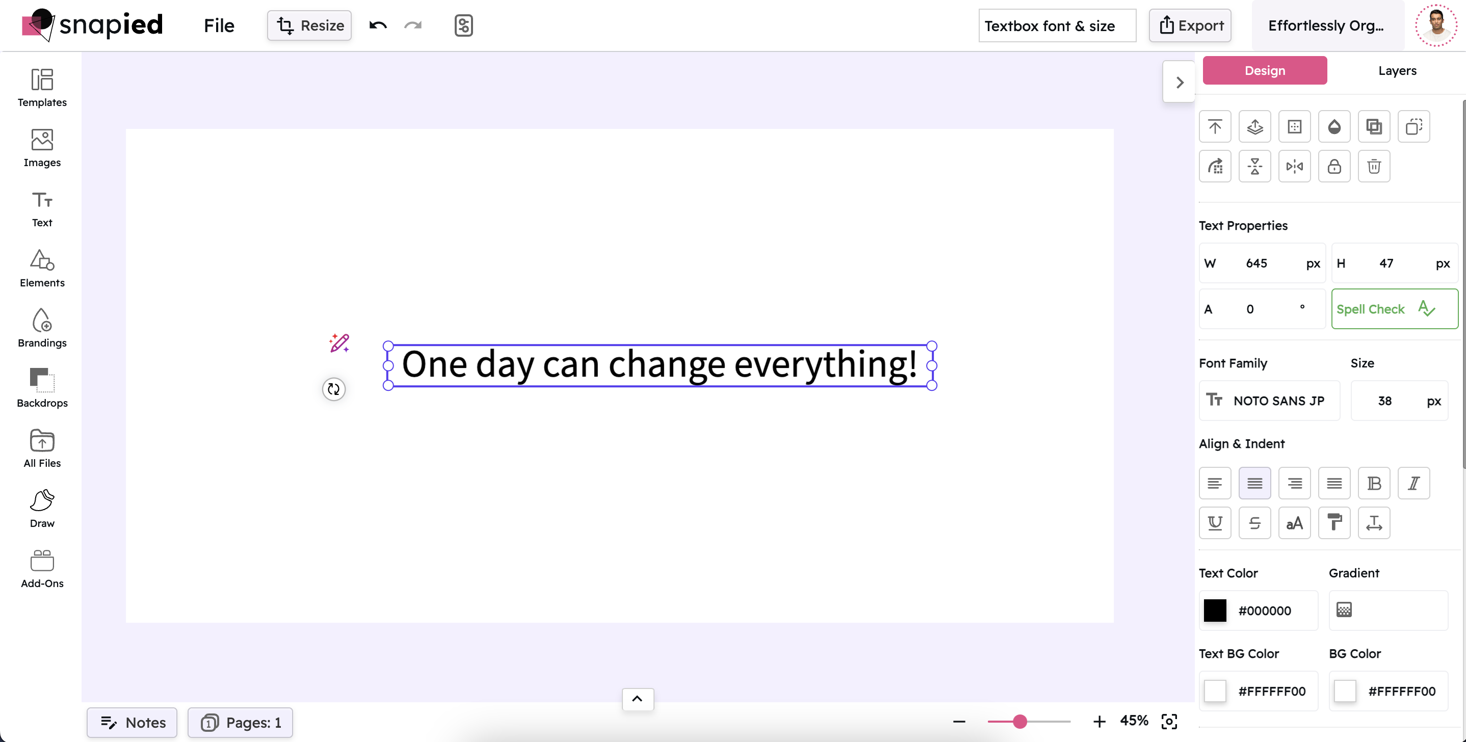
Select Your Textbox
Begin by clicking on the textbox you want to modify. This action activates the text container, ensuring that the upcoming changes affect only the selected text.
Open the Font Family Selector
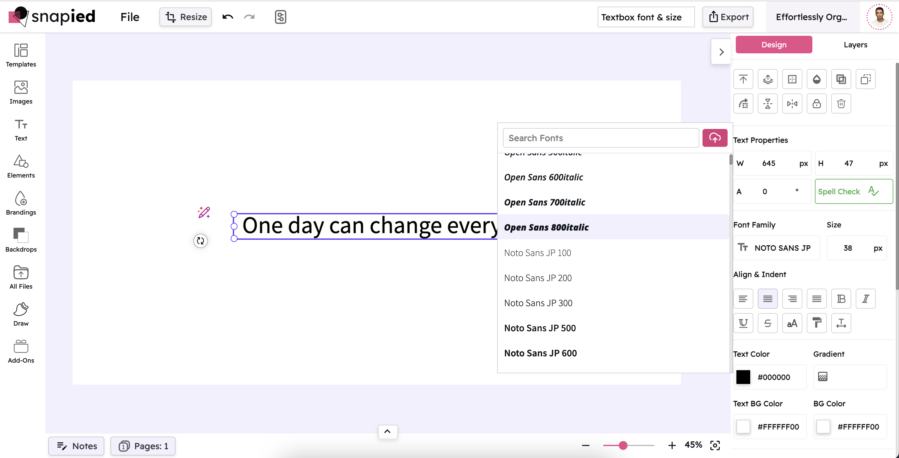
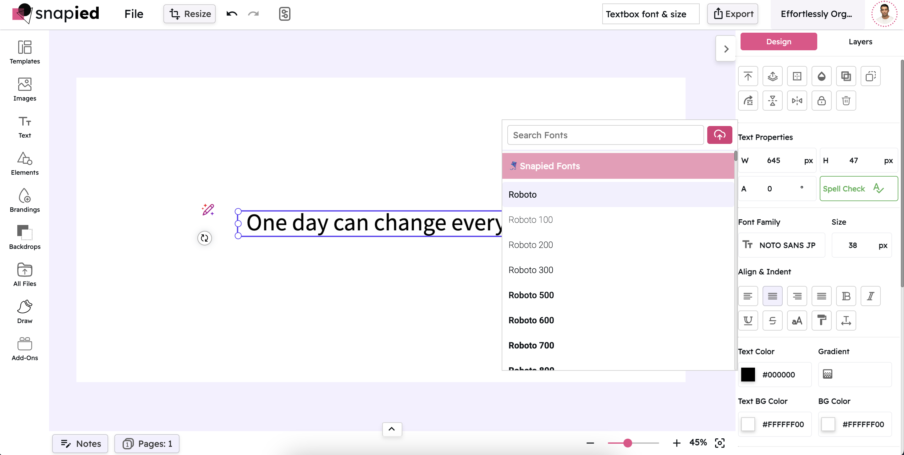
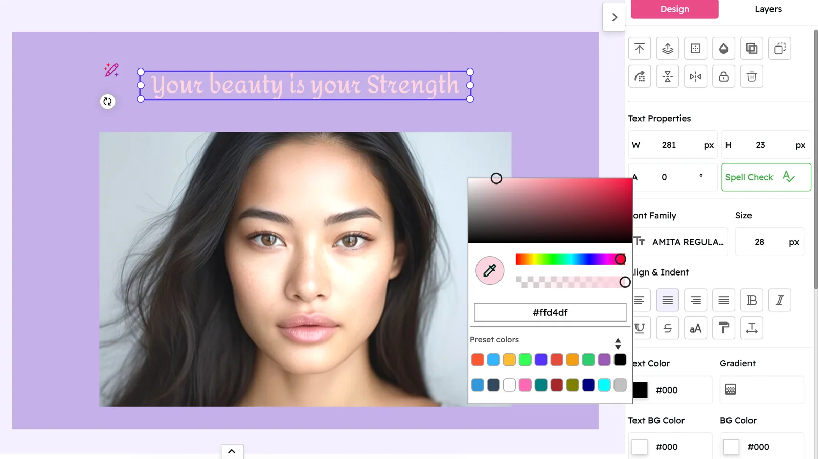
Once the textbox is selected, navigate to the right-hand navigation panel. Here, locate and click on the Font Family option. This will open a dropdown or a dedicated box displaying a range of available font families.
Choose Your Preferred Font
Scroll through the list of fonts presented in the font family box. Click on the font name or family that best aligns with your design's overall look and feel. The chosen font is applied immediately to your textbox, updating the visual style of your content.
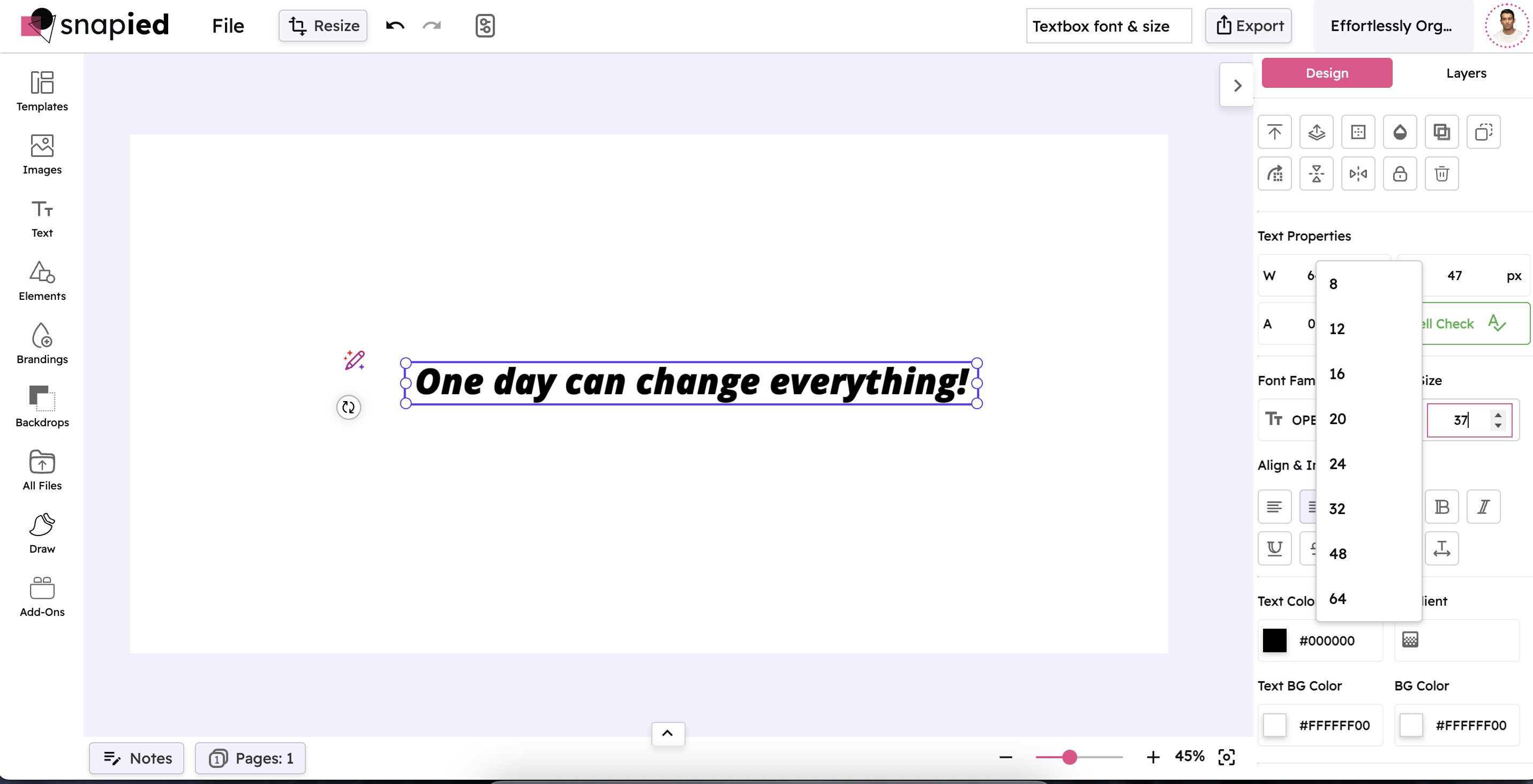
Adjust the Font Size
After selecting the desired font family, you can further refine your typography by adjusting the font size. Look for the font size control in the same navigation panel or nearby toolbar. Use the provided slider or input field to set the size that optimizes readability and fits your design's layout.
Font Family Showcase
Explore different font styles and their unique characteristics
Sans-Serif
Clean, modern, and versatile
Sans-Serif Fonts
Sans-serif fonts like Arial, Helvetica, and Open Sans feature clean lines without decorative finishes. They're excellent for digital interfaces, body text, and modern designs that prioritize clarity and readability.
Serif
Traditional, elegant, and authoritative
Serif Fonts
Serif fonts like Times New Roman, Georgia, and Baskerville have small decorative lines at the ends of characters. They convey tradition, reliability, and formality, making them ideal for academic, legal, or traditional business content.
Monospace
Technical, precise, and structured
Monospace Fonts
Monospace fonts like Courier New, Roboto Mono, and Source Code Pro allocate the same width to each character. They're perfect for displaying code, creating a technical aesthetic, or designing content that requires precise alignment.
Display
Bold, attention-grabbing, and distinctive
Display Fonts
Display fonts like Impact, Bebas Neue, and Playfair Display are designed for headlines and large text. Their distinctive characteristics make them perfect for grabbing attention in headers, posters, and promotional materials.
Handwriting
Personal, creative, and casual
Handwriting Fonts
Handwriting fonts like Brush Script, Pacifico, and Dancing Script mimic human handwriting. They add a personal, creative touch to designs and are ideal for invitations, greeting cards, and casual, friendly communications.
Decorative
Unique, themed, and expressive
Decorative Fonts
Decorative fonts like Papyrus, Comic Sans, and Lobster have distinctive, themed designs. They're best used sparingly for specific creative projects where their unique personality enhances the overall concept or theme.
Font Size Examples
See how different sizes affect readability and impact
This is an example of text at 12px size. It's suitable for footnotes, captions, and legal text where space is limited but information still needs to be accessible.
This is an example of text at 16px size. It's the standard size for body text on most websites and documents, offering good readability across devices.
This is an example of text at 24px size. It works well for subheadings and important paragraphs that need to stand out.
This is text at 36px. Perfect for headings and titles.
48px for major headlines.
Best Practices for Typography in Design
Follow these guidelines to create balanced and effective typography
Consistency is Key
Use the same or complementary fonts across your design to maintain a unified look. Consistency in typography creates a professional appearance and strengthens your brand identity. Limit yourself to 2-3 fonts per design for the best results.
Contrast Matters
Ensure that there is sufficient contrast between your text and its background to enhance legibility. Poor contrast can strain the eyes and make content difficult to read, especially for users with visual impairments. Test your design on different screens to verify readability.
Limit Font Varieties
Avoid using too many different fonts in one project. Typically, one or two font families are sufficient for most designs. Too many fonts can create visual chaos and undermine the professionalism of your design. Instead, use different weights and sizes within the same font family for variety.
Consider the Medium
Different screens and print media may display fonts differently. Test your typography across various devices to ensure consistency. What looks good on your desktop might be difficult to read on a mobile device, so always check your design on multiple screen sizes.
Hierarchy through Size and Weight
Use variations in size, boldness, or italics to create a visual hierarchy that guides your reader's attention to key information. A clear hierarchy helps users scan your content and understand what's most important at a glance. Consider using a scale like 1:1.5 for size progression.
Additional Tips for Using Snapied
Maximize your typography skills with these expert insights
Preview Changes
Always take a moment to preview your typography changes on the live canvas. This immediate feedback helps you understand how your modifications affect the overall design and ensures that your text looks exactly as intended.
Experiment with Combinations
Don't hesitate to try out different font combinations. Sometimes unexpected pairings can lead to innovative design solutions. A common approach is to pair a serif font for headings with a sans-serif font for body text, creating contrast while maintaining readability.
Use Guides and Grids
Align your text carefully using design grids and guides to maintain balance and ensure your layout looks clean and organized. Proper alignment creates a sense of order and professionalism in your design, making it easier for viewers to engage with your content.
Stay Updated
Design trends evolve over time. Regularly check for new fonts and typography tools within Snapied to keep your projects current. Following typography trends can help your designs feel fresh and contemporary, but always prioritize readability and brand consistency.
Pro Tip
For the most professional results, consider the line height (leading) and letter spacing (tracking) of your text. These subtle adjustments can dramatically improve readability and visual appeal. In Snapied, you can find these controls near the font size settings.
When designing for multiple platforms, start with mobile typography first. It's easier to scale up for larger screens than to compress complex typography for smaller devices. This approach ensures your text remains readable across all screen sizes.

Ready to Perfect Your Typography?
Create professional designs with the perfect font family and size for your message.
Your typography speaks volumes about your brand.

