Align & Indent

Perfect Your Text Layout with Precision

A well-structured layout is key to professional design, and proper text formatting can dramatically enhance both readability and aesthetic appeal.

The Align & Indent feature in Snapied allows you to adjust text alignment, set precise indents, and fine-tune spacing—all essential for creating a cohesive, organized design. In this guide, we walk you through the process of using Align & Indent to refine your text presentation.

Perfect Alignment
Precise Spacing
Professional Layout

How to Use Align & Indent

Follow these simple steps to perfect your text layout

1

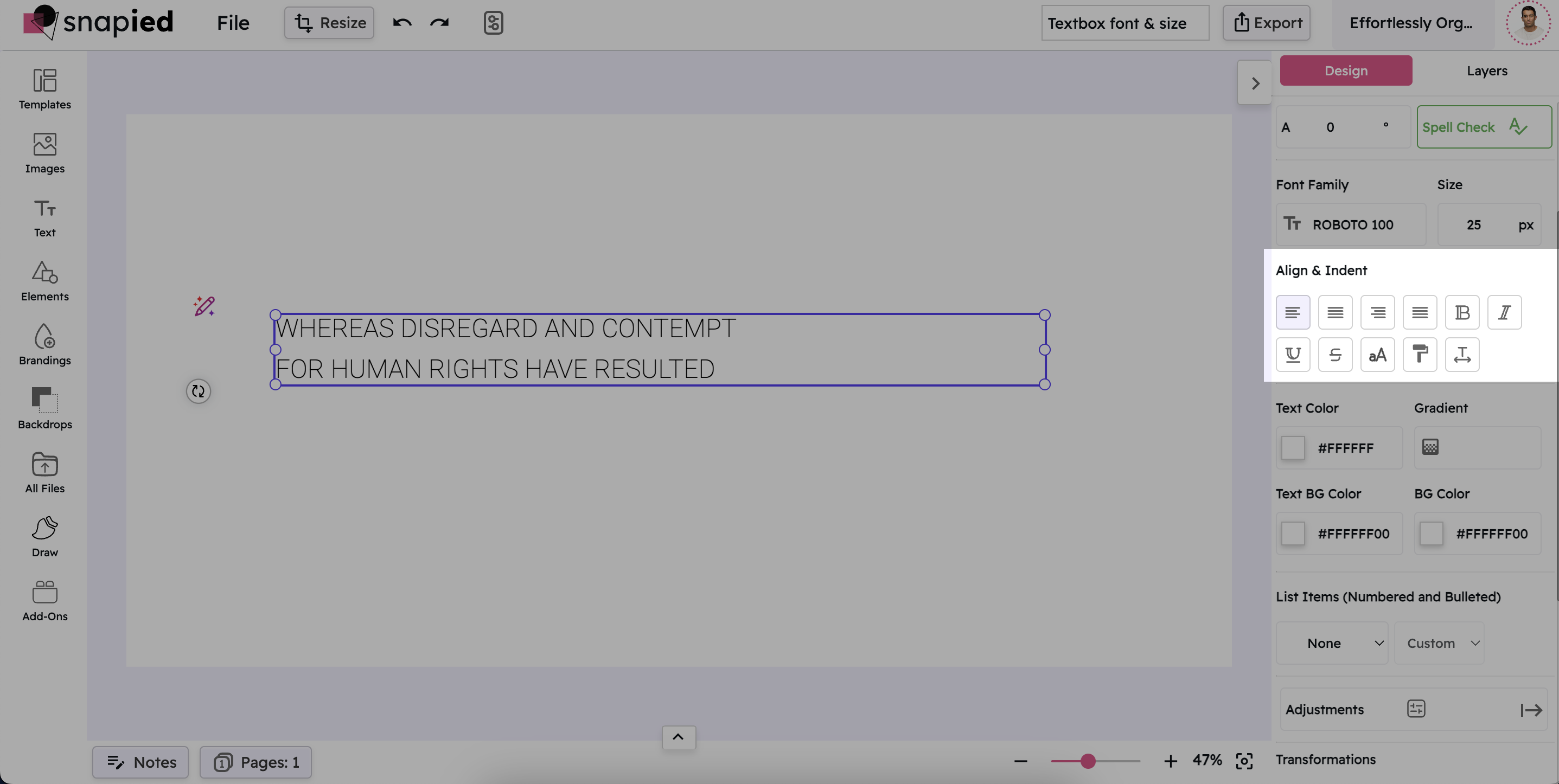
Select Your Textbox

Click on the textbox that contains the content you want to adjust. This ensures the text container is active and ready for modification. The selection will be indicated by a highlight or outline around the textbox.

Selecting a Textbox
2

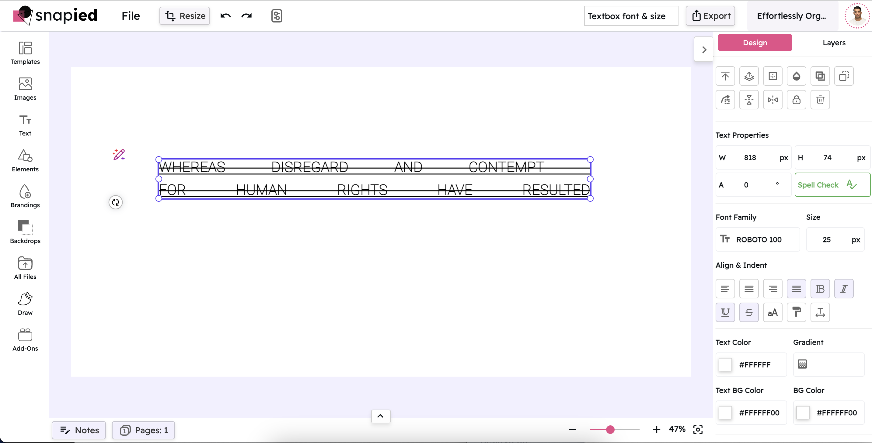
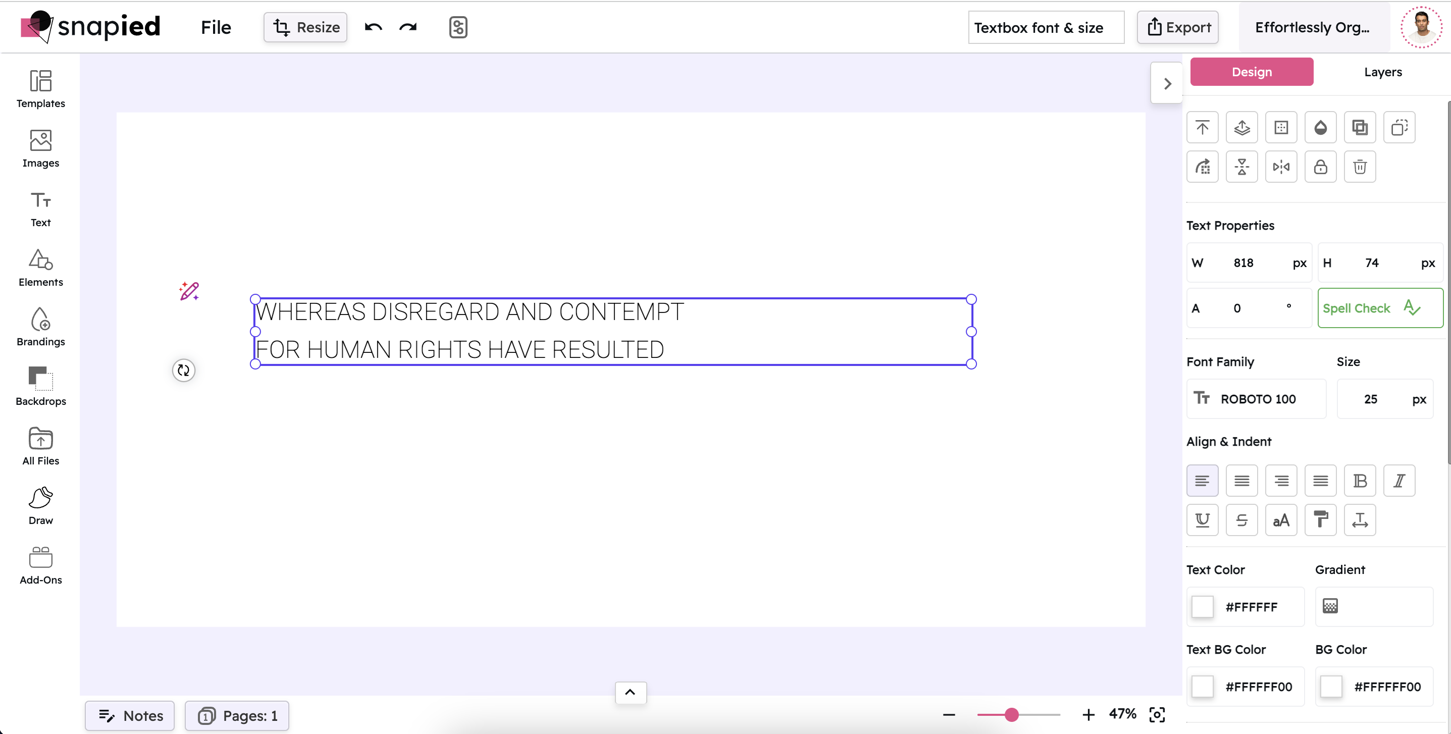
Open the Align & Indent Panel

In the right-hand navigation panel, locate and click on Align & Indent. This action opens a comprehensive suite of formatting options that allow you to fine-tune your text presentation.

Opening the Align & Indent Panel
3

Adjust Your Text Settings

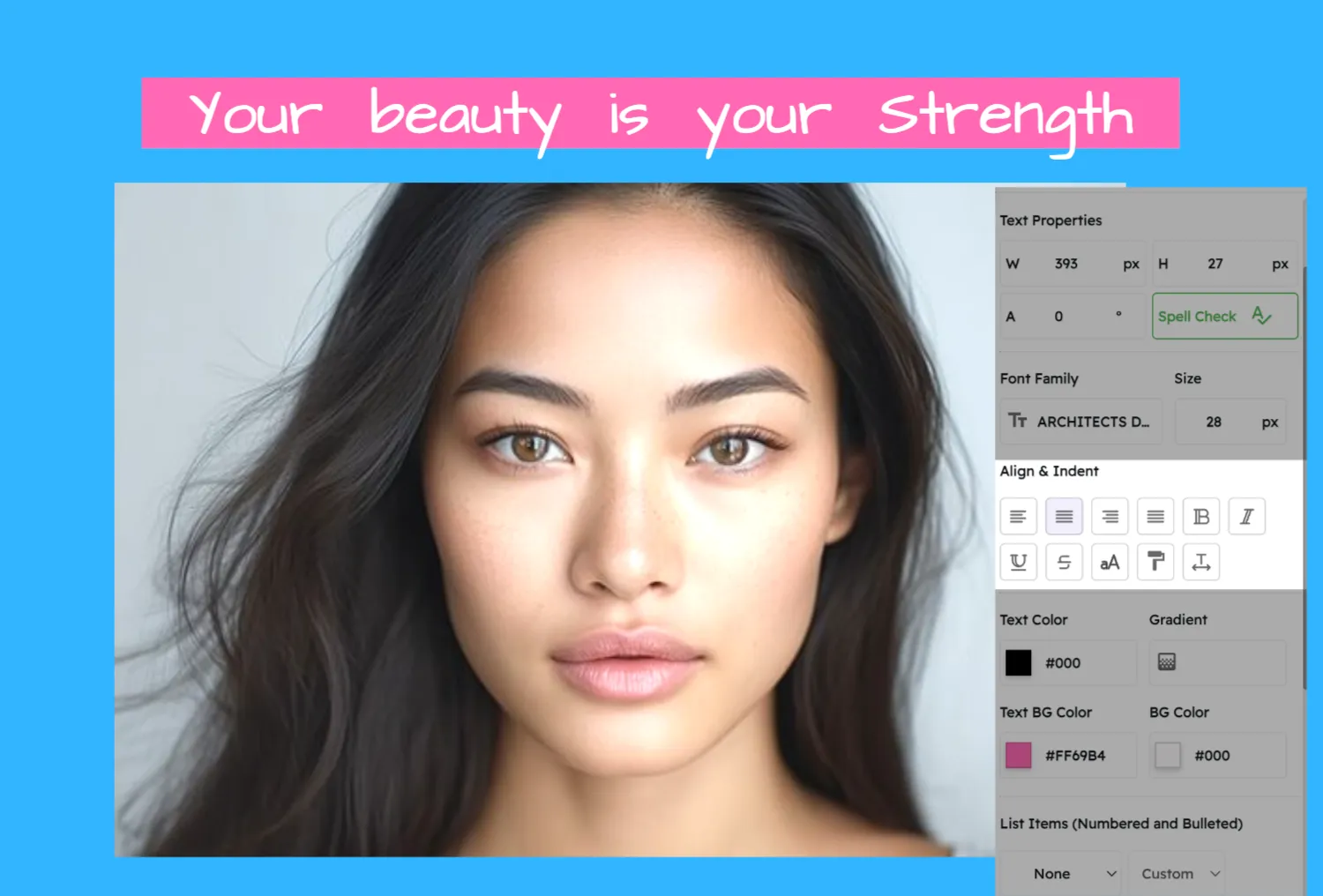
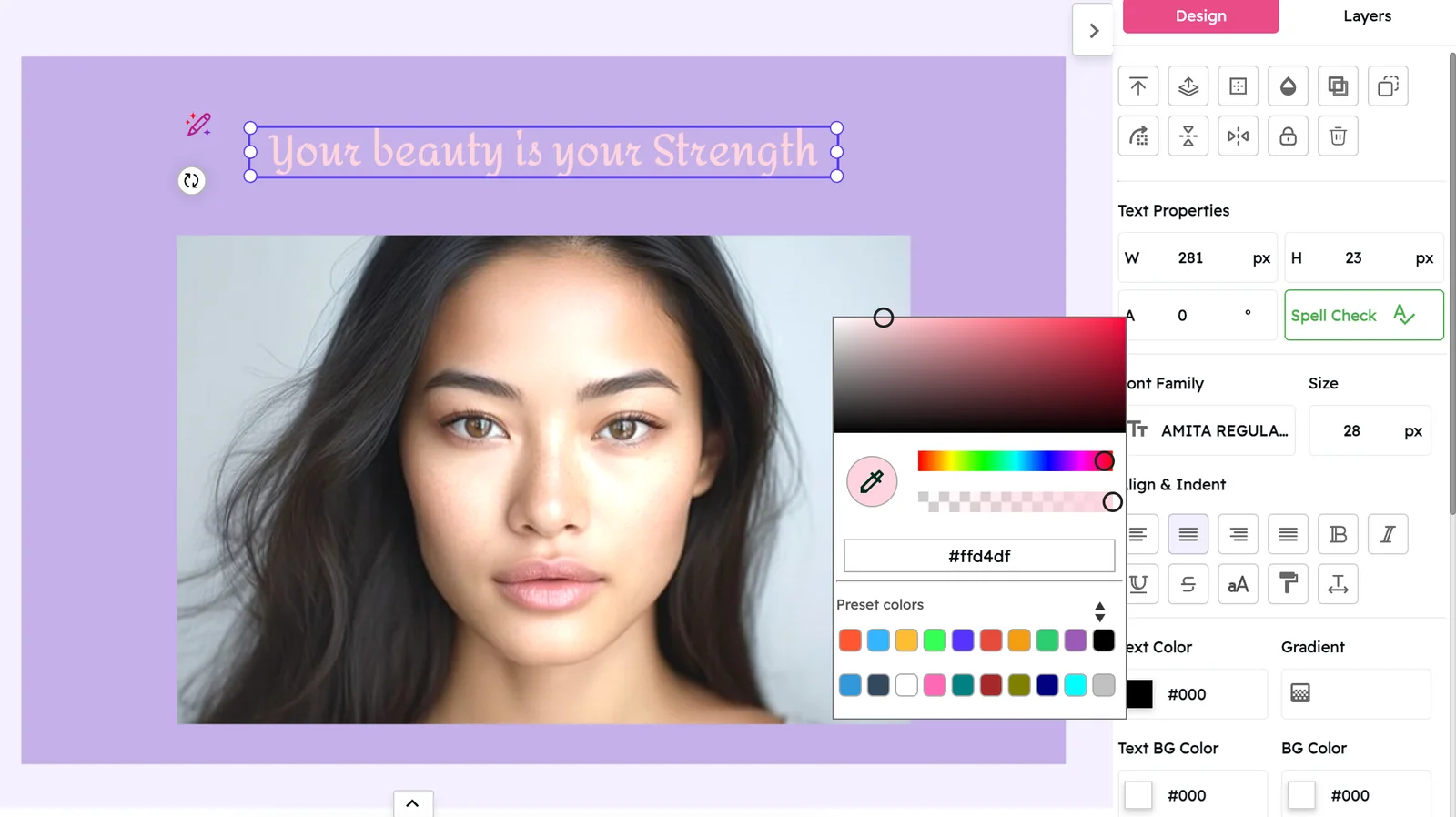
Within the Align & Indent panel, you have access to a variety of controls:

  • Text Alignment: Choose from left, center, right, or justified alignment to position your text exactly where you need it.
  • Indentation: Set custom indents to create a structured hierarchy and ensure a clean separation between paragraphs.
  • Text Styling Options: Apply text styles such as bold, italic, and underline to emphasize important content.
  • Strikethrough: Use this option to cross out text when needed.
  • Line Spacing: Adjust the space between lines to improve legibility and overall flow.
  • Character Spacing: Fine-tune the space between individual characters for a balanced and polished appearance.

Each adjustment is applied instantly, so you can see how your changes affect the overall layout in real time.

Adjusting Text Settings

Alignment & Spacing Examples

Explore different text formatting options and their effects

This text is left-aligned, which is the most common alignment for body text. It creates a clean, organized look with a straight left edge and a ragged right edge. Left alignment is ideal for longer passages of text as it's the easiest to read.

Left Alignment

Left alignment is the standard for most text content. It provides a consistent starting point for each line, making it easy for readers to find the beginning of the next line. This alignment is particularly effective for body text in articles, blogs, and documents.

This text is center-aligned, creating a symmetrical, balanced appearance. Center alignment works well for headings, titles, and short passages that need to stand out. It adds a formal, elegant touch to your design.

Center Alignment

Center alignment creates a formal, balanced look that's perfect for headings, titles, quotes, and short blocks of text. It's commonly used in invitations, certificates, and decorative text elements where symmetry is desired.

This text is right-aligned, with a straight right edge and a ragged left edge. Right alignment can be used for specific design elements like dates in a timeline, captions, or to create visual interest in a layout.

Right Alignment

Right alignment is less common but can be effective for specific elements like dates, page numbers, or captions. It can also be used to create visual interest or to align text with elements on the right side of your design.

This text is justified, creating straight edges on both the left and right sides. Justified text gives a clean, formal appearance and is often used in newspapers, magazines, and books. It maximizes the use of space but requires careful attention to avoid awkward spacing.

Justified Alignment

Justified alignment creates straight edges on both sides of the text block, giving a clean, formal appearance. It's commonly used in newspapers, magazines, and books. When using justified text, be mindful of potential irregular spacing between words.

This paragraph demonstrates text indentation, where the first line is indented to indicate the start of a new paragraph. Indentation helps create visual separation between paragraphs without requiring extra space, making it efficient for dense text layouts.

Indentation

Indentation is used to visually separate paragraphs by moving the first line inward. This technique is common in books, academic papers, and formal documents. It creates a clear visual cue for paragraph breaks without requiring extra vertical space.

This text demonstrates increased line spacing (leading), which adds more vertical space between lines. Proper line spacing improves readability by preventing text from feeling cramped and making it easier for the eye to track from one line to the next.

Line Spacing

Line spacing (or leading) controls the vertical space between lines of text. Proper spacing prevents text from feeling cramped and improves readability, especially for longer content. Increasing line spacing can make dense text more approachable and easier to read.

Why Align & Indent Matters

Discover how proper text formatting enhances your design

Enhanced Readability

Neatly aligned and spaced text is easier to read and understand, ensuring your message is communicated clearly. Proper formatting reduces eye strain and helps readers navigate through your content effortlessly, improving overall user experience.

Consistent Layout

Uniform text formatting creates a harmonious visual experience that ties the entire design together. Consistency in alignment, indentation, and spacing establishes a professional look and helps reinforce your brand identity across all your materials.

Professional Finish

Attention to detail in typography reflects a high standard of design and can make your project stand out. Properly formatted text demonstrates care and craftsmanship, elevating the perceived quality of your work and making a positive impression on your audience.

Pro Tips for Text Formatting

Maximize the impact of your text layout with these expert insights

Be Consistent

Maintain consistent alignment and spacing throughout your design. If you use left alignment for body text in one section, use it for all similar content. Consistency creates a cohesive look and helps readers focus on your message rather than being distracted by formatting changes.

Consider Content Length

Adjust your formatting based on the length of your text. For longer passages, left alignment with slightly increased line spacing improves readability. For shorter text like headings or quotes, center alignment might be more visually appealing. Always prioritize readability over aesthetics.

Create Visual Hierarchy

Use alignment and spacing to establish a clear visual hierarchy in your design. Different alignments can help distinguish between headings, subheadings, and body text. Proper indentation can indicate relationships between different pieces of information, guiding readers through your content logically.

Enhancing Text Layout with Snapied's Align & Indent Feature

The Align & Indent feature in Snapied offers robust tools to refine your text layout with precision. From adjusting alignment and indents to modifying line and character spacing, these options provide you with the flexibility to create a clean, organized, and professional design. By following these simple steps, you can ensure that every piece of text in your project contributes to a cohesive visual presentation.

Remember that good typography is about more than just aesthetics—it's about communication. Properly formatted text helps convey your message clearly and effectively, enhancing the overall impact of your design.

Take the time to fine-tune your text layout, and you'll see a significant improvement in the professionalism and readability of your projects.

Ready to Perfect Your Text Layout?

Create professional, well-structured designs with precise text formatting.

Align. Indent. Impress.

Transform your typography with perfect alignment and spacing.