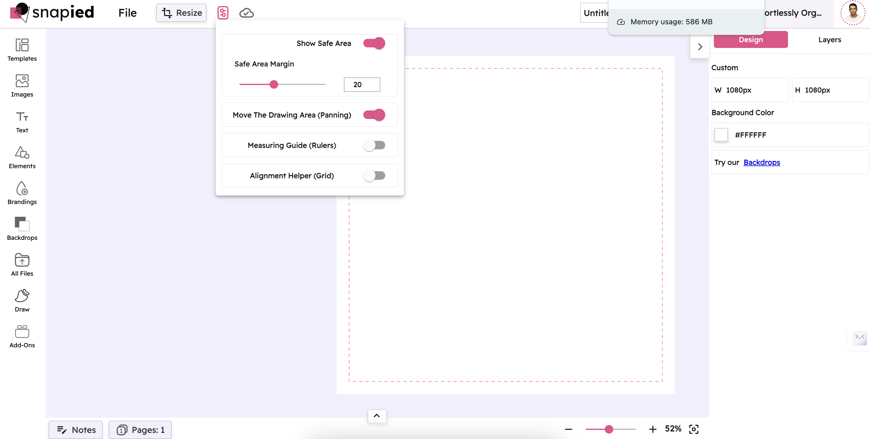
Show Safe Area
Ensure your important content stays within viewable boundaries across all devices with Snapied's Safe Area guide. Create designs that look perfect on any screen.
 Try Snapied Now
Why Use Safe Area?
Cross-Device Compatibility
Ensure your designs look great across all devices by keeping important content within safe viewing areas that won't be cut off by screen edges or notches.
Professional Results
Create designs that follow industry best practices for content placement, ensuring your work looks professional and properly formatted.
Avoid Content Clipping
Prevent important text, logos, or images from being cut off at the edges of different screen sizes and aspect ratios.
Customizable Margins
Adjust the safe area margins to match specific platform requirements or your own design preferences for content placement.
How to Use Safe Area
Access the Guides & Grids Panel
Click on the "Guides & Grids" button in the top toolbar to open the panel with precision tools.
Toggle Safe Area On
Click the toggle switch next to "Show Safe Area" to activate the safe area guide, which will appear as a dashed line on your canvas.
Adjust Safe Area Margin (Optional)
Use the slider or input field to adjust the safe area margin size according to your specific design requirements.
Position Your Content
Place all important content (text, logos, key visuals) within the safe area boundaries to ensure they'll be visible on all devices.
Toggle Off When Finished (Optional)
Once you've positioned your content properly, you can toggle the safe area off if desired, or leave it on as a reference while you continue designing.
Perfect For
Social Media Graphics
Ensure your social media posts display properly across different platforms and devices, with no important content getting cut off in feeds or stories.
Website Headers
Design responsive website headers that maintain their visual integrity across desktop, tablet, and mobile views.
Video Thumbnails
Create video thumbnails with key text and visuals positioned to remain visible regardless of how the thumbnail is displayed.
Mobile App Designs
Design mobile app screens that account for notches, home indicators, and other device-specific elements that might obscure content.
Frequently Asked Questions
A safe area is the region of your design that is guaranteed to be visible on all devices and screen sizes. Content placed outside the safe area might be cut off or obscured on some devices due to differences in aspect ratios, notches, or system UI elements. By keeping important content within the safe area, you ensure it will be visible to all users.
The default safe area margin in Snapied is set to industry standards, but the ideal size can vary depending on your specific design needs. For social media graphics, a margin of 5-10% of the canvas size is typically recommended. For mobile designs, you might need larger margins to account for device-specific elements like notches or home indicators.
Yes, you can place non-essential content or background elements outside the safe area. These elements might be partially cut off on some devices, but they won't impact the core message of your design. This approach is often used for creating visually rich backgrounds that extend to the edges of the screen while keeping important information safely centered.
No, the safe area guide is a design aid that only appears while you're working in the Snapied editor. It will not be visible in your exported designs, ensuring your final output is clean and professional.
Yes, you can adjust the safe area margin for each project individually. This allows you to tailor the safe area to the specific requirements of different platforms or design types. For example, you might use a smaller margin for web banners and a larger one for mobile app designs.
Related Features
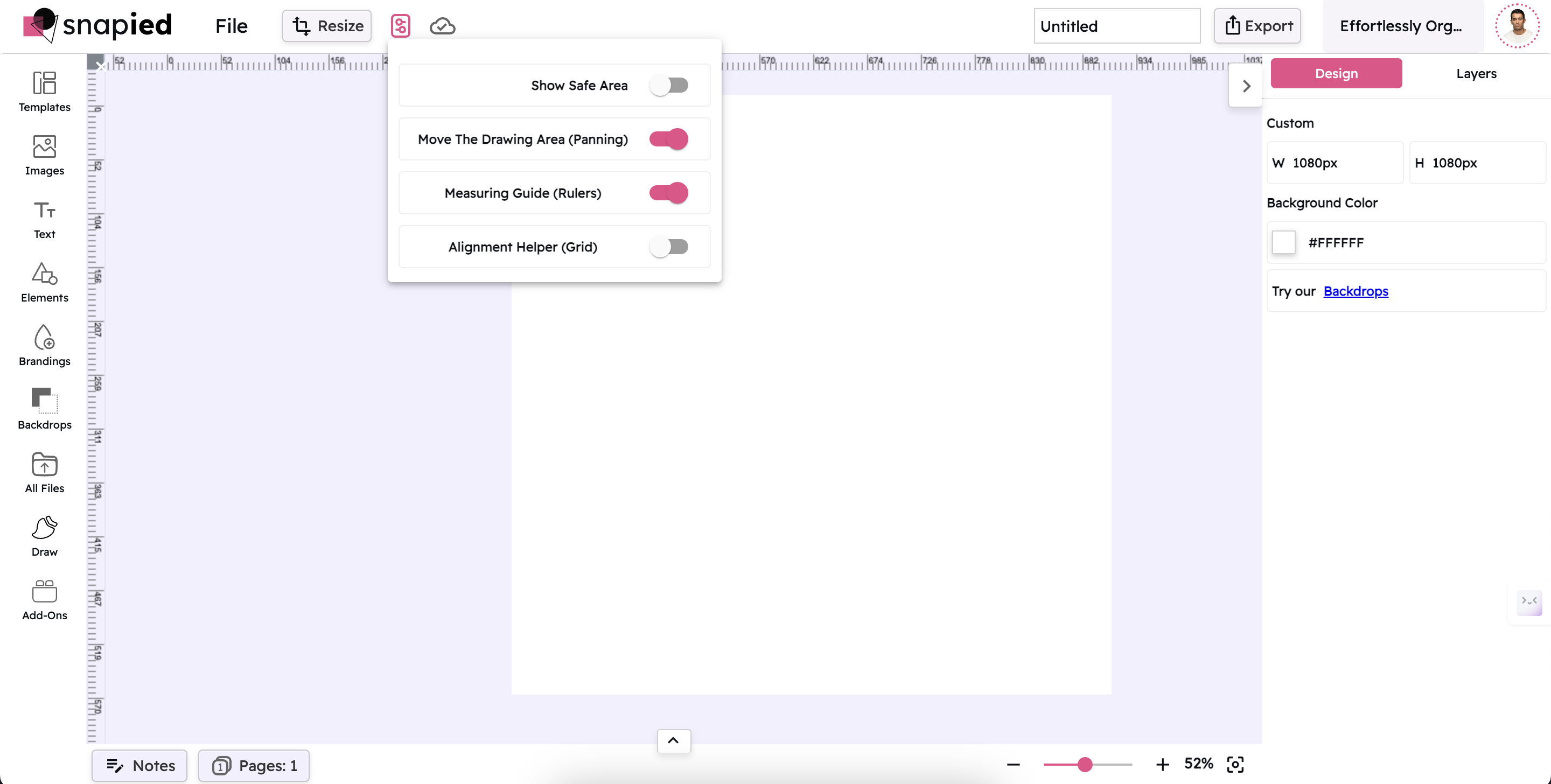
Measuring Guide (Rulers)
Measure distances and align elements precisely with pixel-perfect rulers along the edges of your canvas.
Learn More →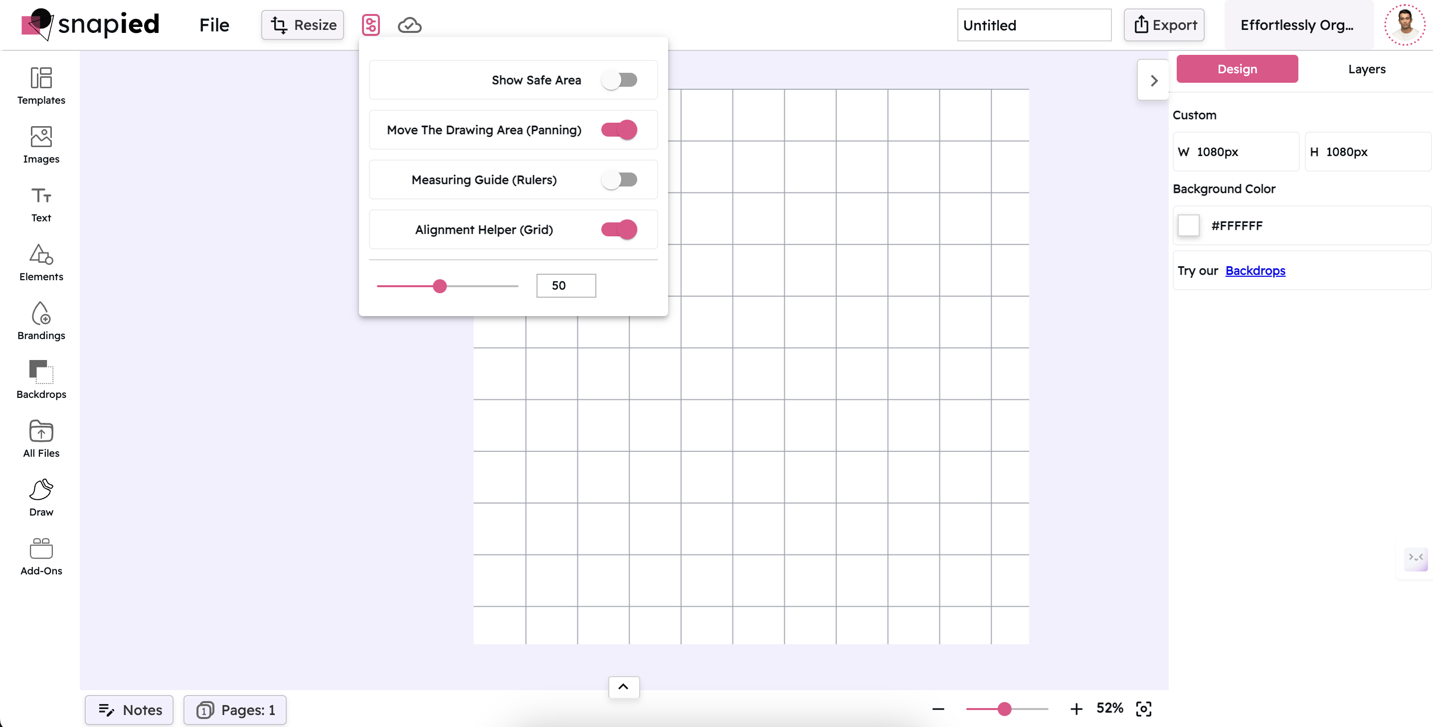
Alignment Helper (Grid)
Create perfectly aligned designs with customizable grid overlays that help you position elements with precision.
Learn More →
Move The Drawing Area (Panning)
Navigate large designs with ease by panning around your canvas, allowing you to focus on specific areas of your work.
Learn More →